 LEAVES
The Eliot Indian Bible — A Leaf from Daniel/Hosea
LEAVES
LEAVES
The Eliot Indian Bible — A Leaf from Daniel/Hosea  (A
LANDMARK). Bible.
Algonquian. Eliot. 1663.
Mamusse wunneetupanatamwe Up-Biblum God naneeswe Nukkone Testament kah wonk Wusku
Testament. Ne quoshkinnumuk nashpe Wuttinneumoh Christ noh asoowesit John Eliot.
Nahohtãoeu ontchetãoe printeuoomuk. Cambridge [Mass.]: Printeuoop
nashpe Samuel Green kah Marmaduke Johnson, 1663. 4to (19 cm; 7.5"). [1] f.
(A
LANDMARK). Bible.
Algonquian. Eliot. 1663.
Mamusse wunneetupanatamwe Up-Biblum God naneeswe Nukkone Testament kah wonk Wusku
Testament. Ne quoshkinnumuk nashpe Wuttinneumoh Christ noh asoowesit John Eliot.
Nahohtãoeu ontchetãoe printeuoomuk. Cambridge [Mass.]: Printeuoop
nashpe Samuel Green kah Marmaduke Johnson, 1663. 4to (19 cm; 7.5"). [1] f.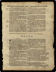
 Click the image for an enlargement.
 The text is Daniel 12:3 (being the end of Daniel's apocalyptic vision of the end days) though Hosea 1–3:5 (with its promises/foretelling of Israel's destruction). It is printed in roman brevier type, in double-column format, with generally 62 lines per column. It took 139 and a half weeks to set the type and print the Bible.
 The Bible was a monumental undertaking and achievement in its day and it remains an American monument today.
• Evans 73; Wing (rev. ed.) B2755; ESTC W38287; Darlow & Moule 6737; Pilling, Algonquian, 139–152; Pilling, Proof-sheets, 1175–77; Winship, Cambridge Press, pp. 208–44. Removed, inner margin slightly irregular; edges chipped (never approaching text) and light soiling.  Definitely, a treasure. (26071)

 Mid-Fourteenth Century
 Bifolium Catholic Church. Liturgy & Ritual. Breviary. Manuscript on vellum, in Latin. “In illo tempore dixit Iesus discipulis suis Auditis quia dictum est: “Diliges proximum tuum et odio habebis inimicum tuum.” Germany: ca. 1360. Small 8vo (12.5 x 17.5 cm; 7"x 10"; for the total bifolium). [1] ff.
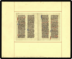 Click the image for an enlargement.
• Very good condtion, in a single-ply mat. (24660)

“Assumpta
est Maria”Catholic
Church. Liturgy & Ritual. Antiphonal.
Manuscript on vellum, in Latin. Spain?, ca. 1750? Folio extra (55 × 33.5
cm, 21.5" × 13.25"). [1] f. 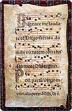
• Vellum soiled, with a few holes or tears along the edges and
a few small holes in the text. Pieces of cellophane tape have been affixed
in the margins of the verso, one running out beyond the page. Much of the
text and music has been erased, or covered over with strips of vellum, and
rewritten.  Interesting
to look at. Though this is one of our smaller pictures, it is one of our larger
leaves!
Interesting
to look at. Though this is one of our smaller pictures, it is one of our larger
leaves!

 NO! Copies of the BOOK in the U.S. Justinianus. A leaf from the Digestum vetus. Venice: Andreas Torresanus, de Asula, 26 March 1491. Folio (42.5 cm; 16.625"). [1] f.
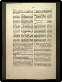 Click the image for an enlargement. In 1479 Torresano acquired the fonts of Nicholas Jenson and in 1505 he acquired Aldus Manutius as a son-in-law!
In the U.S., both Goff and the ISTC only locate only stray leaves of this text: two at Stanford and one at Illinois.
Provenance: Clearly once part of a offering of The Foliophiles Incorporated, and probably from its ad hoc album Pages from the past : a collection of original leaves from rare books and manuscripts [New York: T.F.I., c1926–27].
• ISTC ij00554000; Goff J554; H 9556*; GKW 7675; Pr 4725; BMC, V, 309. Mounted on a brown cardboard backing, with a description (but no bibliographical information) on the verso of the board. Leaf in very good, bright condition. (27100)

A
Prüss Incunable Leaf
Melber, Johannes.
Vocabularius praedicantium, sive Variloquus. Strassburg: [Johann Prüss],
1 June 1486. 4to (20.5 x 14. 5 cm; 8" x 5.5"). 1 leaf. 
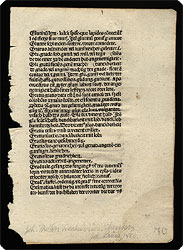
• ISTC im00464000; Goff M464; H 11040*; Pr 516; BMC, I, 119. Inner margin irregular and light semi-circular waterstain in lower outside corner away from text. Leaf identified in pencil in lower margin of the recto side. (26686)
A
“Puzzle” Initial “M”
— Oxford, 1210?Petrus
Riga. Aurora.
Manuscript on vellum, in Latin. England (Oxford?), ca. 1210? 8vo (23.7 ×
12 cm, 9.25" × 4.625"). [1] f. 
 five-line
blue and red “puzzle”initial with pen tracery
also in blue and red. (“Puzzle” initials are inked to appear as
if made up of colored “pieces”—like a jigsaw puzzle—and
they are distinctively, if not uniquely, a feature of English and French 13th-century
manuscripts.) The verso has 3 two-line red initials, 1 three-line, and 1 two-line
blue initials—each of these initials has pen flourishes in the contrasting
color (i.e., blue or red).
five-line
blue and red “puzzle”initial with pen tracery
also in blue and red. (“Puzzle” initials are inked to appear as
if made up of colored “pieces”—like a jigsaw puzzle—and
they are distinctively, if not uniquely, a feature of English and French 13th-century
manuscripts.) The verso has 3 two-line red initials, 1 three-line, and 1 two-line
blue initials—each of these initials has pen flourishes in the contrasting
color (i.e., blue or red).
The text is written in one column of 50
lines on the recto and 51 lines on the verso. The leaf is faintly ruled in
lead on the verso only, the impression of the ruling showing on the recto,
the top line of text being above the top line of ruling; on the right edge
of the page are double rules enclosing the first letter of each line. On
the outer edge are prickings for the ruling. The left edge of the recto has
directions to the rubricator, the explicits of each section being done in
darker ink in a different hand. One line on the verso has been crossed out
with a single thin line of ink. At the bottom of the verso is the quire number
VIII and remnants of a catchword can just be seen at right on the bottom
edge. English
manuscripts from this period are rare.
Provenance: Ex–Zion Research Foundation (later known as the Endowment for Biblical Research); very likely to Zion from Ege.
• Judith, Manuscripts Sacred and Secular, 18, f. 9. A small hole in the lower margin. Parchment a little soiled, especially on the hair side, as is not unusual with English vellum. Traces of adhesive from mounting on the corners of the verso.
 PRINTED
in Black &
Red — Woodcut
Initials — PLANTIN
LEAVES
(Plantin Press). Offered are a selection of very attractive leaves from a sadly incomplete and imperfectly identified Roman Missal printed at Christopher Plantin's press in Antwerp, circa 1570. All leaves are 8vo, measuring approximately 197 x 142 mm or 7 3/4" x 5 3/8" (h x w), and each page is printed in double-column format, in black ink with some words or lines in red; amount of printing in red varies from page to page.
PRINTED
in Black &
Red — Woodcut
Initials — PLANTIN
LEAVES
(Plantin Press). Offered are a selection of very attractive leaves from a sadly incomplete and imperfectly identified Roman Missal printed at Christopher Plantin's press in Antwerp, circa 1570. All leaves are 8vo, measuring approximately 197 x 142 mm or 7 3/4" x 5 3/8" (h x w), and each page is printed in double-column format, in black ink with some words or lines in red; amount of printing in red varies from page to page. 
Available AT THIS WRITING, subject to prior sale: C (the Israelites gathering manna), D (man kneeling in prayer, before a radiance), I (Sts. Peter and Paul), M (woman giving alms), S (the Savior[?] with an orb), and V (the Ascension).
• Each leaf is offered unmatted, in a museum-recommended and -approved clear Mylar sleeve that will allow it to be enjoyed without worry of soiling it with hand oils or dust.

From
the Nuremberg
Chronicle — 8
Portraits
Schedel,
Hartmann. Liber chronicarum. Nürnberg: Anton Koberger,
for Sebald Schreyer and Sebastian Kammermeister, 1493. Folio (42 x 29.5 cm;
16.5" x 11.5"; h x w). 1 leaf.
Nuremberg
Chronicle — 8
Portraits
Schedel,
Hartmann. Liber chronicarum. Nürnberg: Anton Koberger,
for Sebald Schreyer and Sebastian Kammermeister, 1493. Folio (42 x 29.5 cm;
16.5" x 11.5"; h x w). 1 leaf. Click
the image for an enlargement.
Click
the image for an enlargement.
• ISTC is00307000; Goff S307; HC 14508*; Klebs 889.1; Polain(B)
3469; IGI 8828; Oates 1026, 1027, 1028, 1029; Pr 2084; BMC, II, 437.
Old stitching holes in inner margin; one short tear in lower margin;
spotting or old staining (generally light) in margins; no wormholes. Very nice. (26692)
Colophon
Leaf from Padua,
1473
Thomas,
Aquinas, Saint. Summa theologicae. Pars prima. Padua:
Albertus de Stendal, 1473. Folio (28 x 19.5 cm; 11" x 7.75"). 1 leaf.
Padua,
1473
Thomas,
Aquinas, Saint. Summa theologicae. Pars prima. Padua:
Albertus de Stendal, 1473. Folio (28 x 19.5 cm; 11" x 7.75"). 1 leaf.

 Click the images for enlargements.
 The text is St. Thomas' highly influential theological treatise: It is printed in a small gothic with roman influence, in double-column format, 48 lines per column, with hand rubrication and one initial (“A”) accomplished by hand in blue. The type bears all the appearance of a trial font and clearly was one that did not gain favor, thereby making it yet more interesting.
• ISTC it00197000; Goff; T-197; Hain; 1440*; BMC, VII, 911
(IB. 29893); Pr *6781; Oates 2550. Overall dust-soiling; old creasing,
one tear into text without loss, and some small, pin type worming. One margin
reinforced and two other small areas with modern paper reinforcement. A very nice early incunable leaf, and a handsome
representative of an early Italian incunable. (26688)
From a Famous GEOGRAPHY
Magini, Giovanni Antonio. Geographiae universae
tum veteris, tum novae absolutissimum opus, duobus voluminibus distinctum. In
Agrippinensium Colonia: Excudebat Petrus Keschedt, 1597. 4to. [1]f. (pp. 127–28).
GEOGRAPHY
Magini, Giovanni Antonio. Geographiae universae
tum veteris, tum novae absolutissimum opus, duobus voluminibus distinctum. In
Agrippinensium Colonia: Excudebat Petrus Keschedt, 1597. 4to. [1]f. (pp. 127–28).


 Simple
& Clean
Simple
& Clean French
Renaissance Typography
—Giovio, Paolo. Pauli Iouii Nouocomensis episcopi
Nucerini, historiarum sui temporis.... Paris: Ex off. typog. Michaelis Vascosani,
1553. Folio. [1] f. (f. 113).
French
Renaissance Typography
—Giovio, Paolo. Pauli Iouii Nouocomensis episcopi
Nucerini, historiarum sui temporis.... Paris: Ex off. typog. Michaelis Vascosani,
1553. Folio. [1] f. (f. 113). 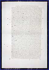
• This leaf is folded in half to fit the folder, with a good scattering of medium-sized, perfectly round pin-type wormholes.

Hand-Rubricated
Hieronymus de Villa Vitis. Panis quotidianus.... Hagenau: Pr. by Heinrich Gran for Johannes Rynmann of Augsburg, 1509. 4to. [1] f. 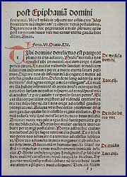


 And You Thought
 LATIN
Abbreviations Were ARCANE!
Lucianus Samosatensis. [Greek, then] ...opera,
qvae Graece extant, omnia.... Basileae: Michael Isengrinus, 1545. 12mo. [1]
f. (pp. 135–36).
LATIN
Abbreviations Were ARCANE!
Lucianus Samosatensis. [Greek, then] ...opera,
qvae Graece extant, omnia.... Basileae: Michael Isengrinus, 1545. 12mo. [1]
f. (pp. 135–36). 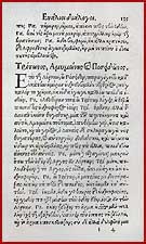
A small sheet, with a pleasantly compact text block.
 Clarity
& Compactness
— Short Slim Page
&
Clarity
& Compactness
— Short Slim Page
& TINY
Print
Seyssel, Claude de. Respublica, sive, status
regni Galliae diuersorum autorum. Ludguni Batavorum: Ex Officina Elzeviriana,
1626. 12mo. [1]f. (pp. 9–10).
TINY
Print
Seyssel, Claude de. Respublica, sive, status
regni Galliae diuersorum autorum. Ludguni Batavorum: Ex Officina Elzeviriana,
1626. 12mo. [1]f. (pp. 9–10).
 • "From a miniature Elzevir, viz., the much-prized volume on France in the `Republic Series', the little pocket library of travel books that have acquired a fame in inverse ratio to their size. The history of the Elzevir family and the growth of the business until it assumed international importance makes fascinating reading; suffice it to state here that Bonaventura, the son of Louis, the founder, and his nephew Abraham were the most capable members of the family, and it was during their control that these miniature volumes were at their best. Printed in Leyden, 1626."
 This leaf is only 4 1/4 inches tall and two inches wide. That's a woman's forefinger, not a man's thumb, in the picture . . .
 That's
it, for the printed “portfolio” leaves!
That's
it, for the printed “portfolio” leaves!
Leaves from a Large 18th-Century CHOIRBOOK (Leaves from
a Graduale romanum). Venice: Balleoniana, 1729. Folio extra
(19.25" x 13.625"). 1 f. 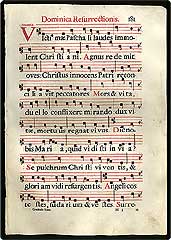
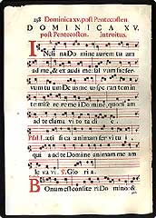 Click either image for an enlargement.
 This particular choirbook was printed with 10 lines of text and music per page. Each leaf contains music and words, and is printed in black and red; text is in black, with an occasional small letter in red, and the music is provided for all the antiphons in black square notation on a four-line red staff. Antiphons begin with a tall decorative initial printed in red, as high as the text and music together. The initials vary from leaf to leaf.
• Crisp, wide margined leaf with slightest bleed-through from one side to another. Printed on handmade paper of 100% rag. A marvelous display, accent, or gift item.
For an array of complete SERVICE
 Extra
SpecialGrabhorn
Press Leaf
BookOne
of FIFTY Copies Only(Aitken
Bible Tribute). The
Bible of the Revolution. Signers' edition[:] containing
original leaves of both Old and New Testaments & an essay concerning it by
Robert R. Dearden, Jr. and Douglas S. Watson[.] San Francisco: Edwin & Robert
Grabhorn for John Howell, 1930. Tall 8vo (27 cm; 10.625"). Frontis., [1] f., pp.
[1–2], [4] ff. of facsimile, pp. [3–4], pp. 5–24, [2] ff., pp.
25–26, [2] ff. of facsimile, pp. 27–34; 3 ports., 1 illus., 4 facsims.
(including a 3-page letter from George Washington), 2 leaves from the Bible, 1
leaf from Franklin's Confession of Faith as below.
Extra
SpecialGrabhorn
Press Leaf
BookOne
of FIFTY Copies Only(Aitken
Bible Tribute). The
Bible of the Revolution. Signers' edition[:] containing
original leaves of both Old and New Testaments & an essay concerning it by
Robert R. Dearden, Jr. and Douglas S. Watson[.] San Francisco: Edwin & Robert
Grabhorn for John Howell, 1930. Tall 8vo (27 cm; 10.625"). Frontis., [1] f., pp.
[1–2], [4] ff. of facsimile, pp. [3–4], pp. 5–24, [2] ff., pp.
25–26, [2] ff. of facsimile, pp. 27–34; 3 ports., 1 illus., 4 facsims.
(including a 3-page letter from George Washington), 2 leaves from the Bible, 1
leaf from Franklin's Confession of Faith as below. 
the
first complete Bible in English printed in the U.S., the Grabhorns
produced an edition limited to 580 copies: 515 copies of the “Colonial
Edition,” 15 “editorial copies,” and 50 copies of the “Signers’
Edition."
We offer a copy of the last of those variants — the decidedly rare
Signers’ Edition. Bound in full morocco, it containstwo
original Bible leaves, one from the Old and one from the New Testament.
(The “Colonial Edition” contains only one leaf, from the Old Testament,
and it was bound in quarter leather.)
Single-click
either image, for an enlargement.
 The
Old Testament leaf here is from Isaiah (XXV:9–12, XXVI:1–XXVIII:1)
and the N.T. leaf is from I Corinthians (VII:1–VIII:7).
The
Old Testament leaf here is from Isaiah (XXV:9–12, XXVI:1–XXVIII:1)
and the N.T. leaf is from I Corinthians (VII:1–VIII:7).
Not content merely to double the ordinary offering of Aitken Bible leaves,
the Signers' Edition added a
special insert on Benjamin Franklin that contains a third original leaf
— this from Franklin's 1745 printing of the Confession of Faith
— being, in this copy, the start of ch. XXVIII, “On Baptism.”
Found only here in the Signers’ Edition, in addition to the standard (and handsome) facsimile of a 3-page letter from George Washington, are a facsimile of Aitken's printing of the Declaration of Independence and a special frontispiece that presents facsimiles of all of the signatures of the signers of the Declaration of Independence.
All editions of this fine leaf book end with Edwin Grabhorn’s still-notable essay on typography in America at the time of the Revolution.
• Full crushed morocco, some spots to covers and without the slipcase; clean, and quite a good copy. (10453)
Leaf-lovers
should see also, perhaps,
